
Abstract wall art is the rare category that works almost anywhere. It carries no story you have to explain, no subject you have to like, just color, shape, and movement that set a mood. That is exactly why it sells so well and why people freeze in front of a hundred options online and buy nothing.
This guide fixes that. We will cover what abstract art actually is, the main styles you will run into, and how to pick the right piece by color, scale, and framing. By the end you should be able to look at a wall in your home and know what kind of abstract wall art belongs on it.
If you already know you want something modern and gestural, our companion piece on modern abstract canvas art goes deeper on that specific look. This one stays broad so you can compare every style side by side first.
What abstract art actually is
Abstract art is any piece that does not try to copy the real world. Instead of a recognizable landscape or face, you get arrangements of color, line, texture, and form. Some abstract artwork hints at something familiar, a horizon, a figure, a wave, while some is pure composition with no reference at all.
That openness is the point. A realistic painting tells you what to think. Abstract canvas art hands the feeling to you and lets your eye finish the work. Two people can stand in front of the same piece and read it completely differently, and both are right.
For a room, this matters in a practical way. Abstract art does not compete with your furniture, your books, or the view out the window. It supports the space instead of demanding the spotlight, which is why it slots into so many homes without a fight.
Why it works in almost any room
The biggest reason abstract canvas wall art is so flexible: it reads as color and energy before it reads as a subject. You are decorating with a mood, not a literal scene, so the same piece can feel calming in a bedroom and confident in an office.
- It bridges styles. A textured neutral abstract sits happily in a modern loft, a farmhouse, or a transitional living room.
- It scales up cleanly. Big abstract pieces fill a blank wall without looking busy, which is hard to pull off with detailed representational art.
- It forgives. You do not have to match an exact object or season. You match a palette and a feeling, and that is far easier to get right.
The main styles, explained
Most abstract artwork falls into a handful of recognizable styles. Knowing them turns shopping from scrolling into searching.
- Geometric. Clean shapes, grids, blocks, and hard edges. Feels modern, ordered, and architectural. Great in offices and contemporary rooms.
- Fluid and pour. Marbled, flowing color that looks liquid. Soft and organic, with a high-end resin look that suits living rooms and entryways.
- Minimalist line. A few simple strokes or a single figure drawn in one continuous line. Quiet, gallery-like, perfect for small or busy walls.
- Color field. Large washes of one or two colors with soft transitions. Calm and immersive, built to set a mood rather than show a shape.
- Expressionist. Bold, gestural brushwork full of motion and emotion. The most energetic option and the strongest statement piece.
- Textured and impasto. Thick, raised paint or plaster you can almost feel. Adds depth and a tactile, artisan quality even in neutral tones.


Abstract styles compared
Here is the fast version. Use it to match a style to the room you are actually decorating and the palette you already live with.
| Style | The look | Best room | Typical palette |
|---|---|---|---|
| Geometric | Crisp shapes and hard edges | Office, modern living room | Black, white, primary accents |
| Fluid / pour | Marbled, liquid color | Living room, entryway | Teal, gold, blush, cream |
| Minimalist line | Few simple strokes | Bedroom, hallway, gallery wall | Mono, beige, soft black |
| Color field | Large washes of color | Bedroom, meditation space | Sage, terracotta, dusty blue |
| Expressionist | Bold gestural brushwork | Statement wall, dining room | Saturated, high contrast |
| Textured / impasto | Raised, tactile paint | Living room, neutral interior | Cream, sand, warm grey |
Choosing by color and palette
Color is the first thing the eye registers, so start there. The reliable move is to pull a secondary color from your room, a cushion, a rug, the wood tone, and find abstract artwork that features it. The piece then looks intentional instead of dropped in.
Two simple approaches both work:
- Blend in. Pick tones close to your wall and furniture for a calm, layered look. Best in bedrooms and rooms you want to feel restful.
- Pop out. Choose a contrasting accent color so the art becomes the focal point. Best on a feature wall or above a neutral sofa.
If you are nervous, neutral abstract canvas art in cream, sand, and warm grey is the safest entry point. It reads as texture more than color, so it almost never clashes.

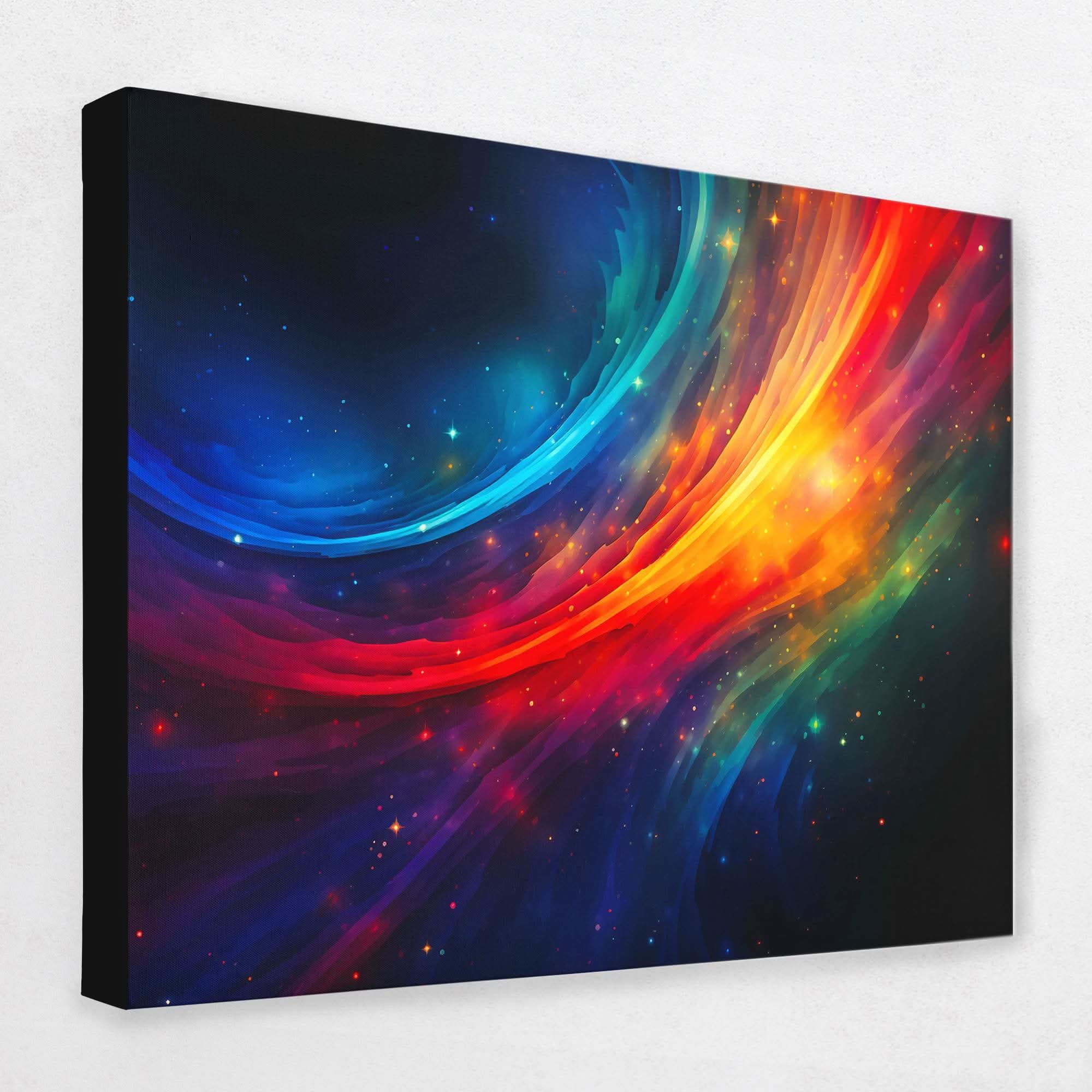
A warm, layered palette that pulls accent tones out of wood furniture and brass fixtures. Hang it where the light shifts through the day and the colors will keep changing with it.
View this pieceScale and placement
Most people buy abstract art too small. The art ends up looking like a stamp on a big blank wall. As a rule, art above a sofa or bed should span roughly two thirds of the furniture width, and a single statement piece should fill most of the open wall it sits on.
Eye level is the other thing to get right. Center the piece around 57 to 60 inches from the floor, which is standard gallery height. Above furniture, leave a hand-width gap, about 6 to 10 inches, between the top of the sofa and the bottom of the frame.
Cut the art to size in painter's tape on the wall before you commit. Live with the outline for a day. It is the cheapest way to catch a piece that is too small or hung too high.
Not sure how a size will read in your actual room? Run it through our room visualizer first so you are choosing scale with your eyes, not guessing with a tape measure.
Framed vs gallery wrap, and sets
Once you have the piece and the size, two format choices remain.
- Gallery wrap. The canvas stretches around the frame with no border. Clean, modern, and a touch more casual. It suits most abstract canvas wall art and contemporary rooms.
- Framed. A floating or traditional frame adds a finished, formal edge. Worth it in dining rooms, offices, and more classic interiors.
Sets are the other lever. A diptych (two panels) or triptych (three) spreads one composition across a wider span, which is perfect for long walls above a sofa or bed. Sets of two and three are some of the most-bought abstract formats because they fill horizontal space without you having to find one enormous single canvas.
More abstract wall art picks


Common mistakes and matching to your decor
A few errors come up again and again. Skip these and you are most of the way to a wall you are happy with.
- Going too small. The number one mistake. When in doubt, size up.
- Matching too hard. Art that matches your cushions exactly looks like a showroom. Pull one shared color and let the rest contrast.
- Hanging too high. Art floating near the ceiling disconnects from the room. Anchor it to the furniture below.
- Ignoring mood. A frantic expressionist piece in a bedroom fights the room's job. Match the energy of the art to the energy of the space.
To match decor, think in terms of contrast and weight. Minimal rooms can take a bold expressionist or geometric piece as their one loud note. Busy, layered rooms calm down with a quiet color field or line piece. Browse the full abstract wall art collection with your room's palette and mood in mind, and the right piece tends to announce itself.


