
The kitchen is the one room where art has to earn its spot. Wall space competes with cabinets, the range hood, open shelving, and the fridge, and whatever you hang there lives near steam, splatter, and swinging temperatures. Good kitchen wall art works around all of that instead of fighting it.
The trick is matching the subject, the size, and the framing to how the room actually gets used. A piece that looks great in a living room can read as too precious over a stovetop. Below is how to choose kitchen wall decor that fits the space, survives the conditions, and still looks intentional.
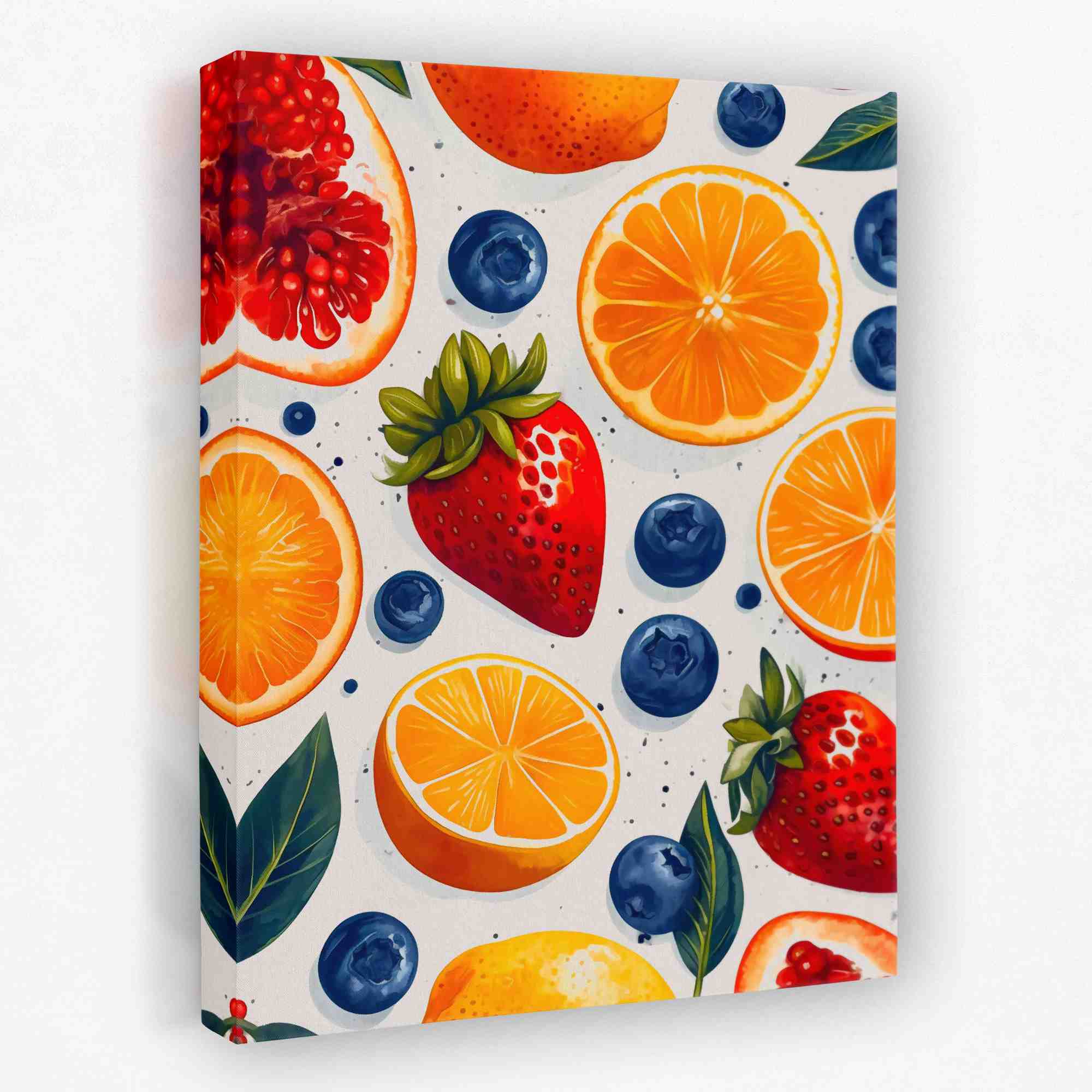
If you want to browse while you read, our kitchen canvas art collection is grouped around exactly these subjects.
What actually works on a kitchen wall
Kitchens have a built-in theme, so the easiest wins are subjects that nod to food and drink without turning the room into a diner. A few categories pull their weight here:
- Food and produce: citrus, avocado, fresh fruit, and herbs add color and read instantly as kitchen-appropriate.
- Botanical and nature: leaves, florals, and greenery keep things fresh and pair with almost any cabinet color. Browse botanical wall art for this look.
- Coffee and tea: a roast scene or a quiet tea still life near the coffee station gives a small wall a clear job.
- Typography: short phrases or a single word work over a breakfast nook, though one is usually enough.
- Citrus and bright abstracts: warm tones bounce light around and lift a darker galley kitchen.
The rule of thumb: pick subjects that feel at home around food. You do not need a literal fork-and-spoon print to signal kitchen.
Durability near heat and grease
This is the part most guides skip. Heat is not usually the problem on its own, since wall surfaces a few feet from the range rarely get hot. The real issues are airborne grease, steam, and the slow film that settles on everything in a kitchen over months.
Canvas handles this better than cheap paper prints because the surface can be wiped down gently and there is no glass to fog. A few practical notes:
- Give the cooktop and sink a buffer of a few feet. Side walls and the eating area are safer than the wall directly behind the burners.
- A range hood that actually vents outside does more to protect your art than any coating.
- Wipe canvas with a soft dry cloth every few weeks so grease film never builds up.
- Avoid hanging delicate framed paper right beside a frequently used stove. Save those spots for canvas.


Washable framing choices
Framing in a kitchen is a maintenance decision as much as a style one. Each option has a tradeoff:
- Stretched canvas, no frame: easiest to wipe, no glass to fog, sits flat against the wall. The most forgiving choice near cooking.
- Floating frame on canvas: adds a finished edge while keeping the wipeable surface. A nice middle ground for a dining-side wall.
- Framed under glass: looks crisp but glass collects steam and grease film and needs regular cleaning. Best kept away from the range.
For most kitchens, canvas in a high-traffic spot and framed glass reserved for the calmer eating area is the combination that ages well.
If you love a framed-glass look near the stove, hang a second cheaper print there first and check how much film it collects over a month. That tells you whether the spot is safe for the piece you actually care about.
Placement: small walls, above cabinets, breakfast nooks
Kitchens are full of awkward leftover wall space, and that is where art does the most work. The three spots that come up most often:
- Small walls and gaps: the strip between a window and a corner, or the end of a run of cabinets, suits one tall vertical piece.
- Above the cabinets: if there is a gap to the ceiling, a wide horizontal canvas or two leaning pieces fill it without clutter.
- Breakfast nook: this is the gallery-friendly zone, away from the cooking. Hang art at standard eye level, around 57 to 60 inches to center, since people sit and linger here.
Open shelving and a pot rail eat into wall space, so measure the real estate you have before falling for a large piece. A nook or a dining-side wall almost always gives you more room than the cooking zone.

A soft still life like this earns its keep in a breakfast nook or beside a coffee station, where people sit long enough to actually look at it. Away from the cooktop, framing options open right back up.
View Afternoon TeaBest art by kitchen style and where to hang it
Subject, framing, and placement should follow the kitchen you actually have. Here is a quick reference for the most common setups:
| Kitchen style | Best art subject | Framing | Where to hang |
|---|---|---|---|
| Modern / minimal | Citrus, abstract, single botanical | Frameless canvas | Small side wall or above cabinets |
| Farmhouse | Produce, herbs, soft florals | Floating wood frame | Breakfast nook or open shelf wall |
| Galley (narrow) | One tall vertical, warm tones | Frameless canvas | End wall, away from cooktop |
| Open-plan kitchen | Larger statement or set of 2 | Canvas or floating frame | Dining-side wall facing the room |
| Coffee corner | Coffee roast, tea still life | Framed (calm zone) | Above the coffee station |
Sizing and matching cabinets or backsplash
Sizing in a kitchen runs smaller than in a living room because the wall space is broken up. A single piece should fill about two-thirds the width of the wall or furniture run below it, not the whole wall. Over a nook table, aim for roughly two-thirds the table width.
Color is where a kitchen piece either clicks or clashes. A few easy moves:
- Pull one accent from the room: echo a backsplash tile color or a cabinet hardware finish so the art looks chosen, not random.
- White or light cabinets: you have freedom for bold, saturated subjects like citrus or fresh produce.
- Dark or wood cabinets: warm metallics, gold, and cream keep the wall from going flat.
- Busy backsplash: go simpler on the art so the two do not compete.
Greenery and nature art is the safest color bridge of all, since natural tones sit comfortably against nearly any cabinet and counter combination.
More kitchen wall art picks


A gallery wall in the kitchen
A small gallery wall belongs in the eating area, not over the range. Keep it tighter than a living room arrangement, since kitchen walls are narrower and you want it to read as one block.
- Pick a loose theme so the mix feels deliberate. Food and botanical subjects sit together naturally.
- Use two to four pieces, not the sprawling grids you see in hallways.
- Keep spacing tight, around two inches between frames, so the cluster holds together.
- Lay it out on the floor or with paper templates before putting holes in the wall.
If you would rather skip the arranging, a set of two canvases of the same size gives you the gallery feel with none of the alignment guesswork. You can shop the full range in our kitchen canvas art collection and pull a matched pair from one subject.


